The right heritage colour scheme can elevate the historic character of your home, accentuating period features and architecture. A glossy black regency front door makes a period brass knocker stand out like a jewel, while a pale oatmeal limewash on a Georgian facade recreates the authentic understated grace of the period.

Pictured: Graphenstone Heritage Entrance Hall Blue
Pick the wrong shade, like a brilliant modern white on crumbly lime render, and the building can look jarring. Choosing the right heritage colour scheme means the house looks as if it could have been that way forever.
Some old homes, such as listed buildings or those in conservation areas are protected by planning laws from changes that fundamentally alter their appearance, including colour scheme changes.
Why Natural & Organic Paints Are Suitable for Heritage Properties
Breathability is crucial in heritage homes. Solid walls need to release moisture, not trap it. Natural paints like lime, clay and mineral based formulations allow water vapour to pass through, helping prevent damp, mould and surface damage in both exterior masonry and interior plaster.
Natural and organic paints deliver an authentic, matte finish that enhances period features. Unlike modern acrylics, they don’t form a plastic film. Instead, they bond with the surface and age gracefully, avoiding peeling or blistering.
Natural paints support healthier living too. Most are free from VOCs, petrochemicals and synthetic additives, making them safer for older properties with limited ventilation. Some, including lime paints, even absorb CO₂ as they cure.
With breathable protection, heritage appropriate finishes and low toxicity ingredients, natural paints are a smart choice for restoring and protecting period interiors and exteriors alike.
Period Paint Colour Schemes
The early eighteenth to early twentieth centuries saw a series of colour palettes applied to period properties. Each era had its own pigment technology, social aspirations and lighting conditions which combined to produce very distinct period colour palettes.
Here’s a whistle stop tour of four key periods:-
Georgian Paint Colour Schemes (1714 - 1837)
Georgian taste was governed by Palladian architectural ideals: calm facades in the same muted stone tones you see on classical ruins, and joinery picked out in deeper, slightly smoky greens or almost-black “invisible” hues. Inside, the palette broadened. Wealthy owners flaunted newly imported Pompeian reds and vivid Wedgwood blues in dining rooms and saloons, while servants’ areas stayed firmly in drabs and buffs.

Pictured: Graphenstone Heritage Bath Stone
Graphenstone Heritage Shades to Consider:
Exteriors & circulation spaces - Bath Stone and Deal Stairs echo the pale stone colours of the Georgian period; Kenwood Cream gives the same quiet lift to interior cornices.
Joinery & doors - Butler’s Green emulates a mid-tone Georgian celadon; Gables Green offers a much darker green option.
Statement rooms - Dressing Room delivers that warm terracotta; Mansfield’s Blue and Pavilion supply the aristocratic blues.
Regency Paint Colour Schemes (1811 - 1820)
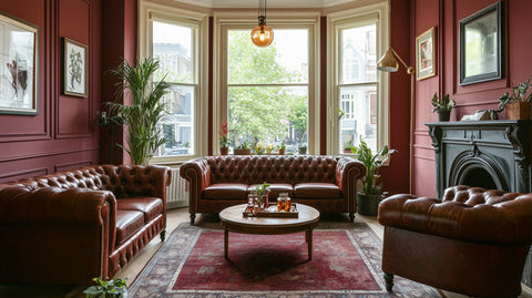
The short Regency period chased light and brilliance. Advances in chemical pigments (notably verditer and chrome yellows) and the Prince Regent’s own flair encouraged cleaner, higher brightness versions of Georgian favourites. Delicate pea greens were applied on front doors, blue verditer drawing rooms hosted grand gatherings, and pastel stucco facades glowed in London’s sooty light.

Pictured: Graphenstone Parlour Pink
Graphenstone Heritage Shades to Consider:
Doors & shutters - Mansfield’s Blue captures that refined blue-green.
Hallways & stairs - Chinoiserie and Parlour Pink mirror the fashionable peach- and coral-tinted plasters.
Formal rooms - Entrance Hall Blue provides the showpiece verditer-type blue.
Exteriors - De Grey and Kenwood Cream recreate the warm, breathable stucco creams.
Victorian Paint Colour Schemes (1837 - 1901)
Victorian paint colour was bold and sometimes theatrical. Cheap coal tar dyes and mass produced synthetic pigments made deep Brunswick greens, Indian reds, oxbloods and peacock blues affordable beyond the aristocracy.
Outside, brick detailing was often picked out in creams or Indian red for contrast, while dark gloss on doors helped mask London grime.

Pictured: Graphenstone Butlers Green
Graphenstone Heritage Shades to Consider:
Doors & railings - Gables Green stands in for Brunswick green; Red Damask for Indian red.
Hallways - Smalt Blue delivers the cobalt-rich hall colour; Blackbean supplies an earthy, lacquer-like brown for panelled entrances.
Brick string courses - Bath Stone is an attractive and authentic cream accent.
Dining & parlours - Butler’s Green and Dressing Room are a match for the green and deep-terracottas of the victorian period.
Edwardian Paint Colour Schemes (1901 - 1914)
Edwardian decorators moved away from Victorian heaviness with lighter, garden inspired tints. Sage, eau-de-Nil and airy creams dominated timberwork; pastel yellows warmed north facing halls; muted pinks softened drawing rooms. Exterior joinery moved toward gentle grey-greens that complemented roughcast render and red brick.

Pictured: Graphenstone Golden Pheasant
Graphenstone Heritage Shades to Consider:
Exterior timber & soffits - Notebook gives Edwardian grey-green.
Halls - Golden Pheasant introduces the period’s buttery pastel yellow. A warmer shade than eau de nil.
Edwardian Front doors - Pavilion offers the restrained teal often chosen for Arts-and-Crafts houses.
Reception rooms - Lacewing provides a coral-rose accent, while Kenwood Cream lightens ceilings and friezes.
Popular Heritage Paint Colours
Here’s an overview of popular heritage paint colours that endured throughout different time periods.
Heritage Green Paints
Green is a heritage workhorse. Georgian joiners chose soft celadons to echo garden foliage without shouting against pale stone; Regency fashion brightened the tone to pea green; Victorians dove into near black Brunswick; and the Edwardians mellowed everything back to sage and grey green.
Graphenstone Heritage Green Shades to Consider:
Butler’s Green - mid-tone, slightly greyed; ideal for Georgian shutters or panelling.
Notebook - warm grey-green; a restrained nod to Regency pea green.
Gables Green - deep Brunswick green. Perfect Victorian front door statement.
The Map Room - muted library green that straddles several eras.
Blackbean - almost black with a brown bias; could stand in for high-Victorian gothic trims
Heritage Blue Paints
Blue has long been a status signal: the rarer the pigment, the grander the room. Regency decorators embraced luminous blue verditer; Victorians revelled in peacock and teal; Edwardians kept the richness but dialled down the gloss.
Graphenstone Heritage Shades to Consider:
Mansfield’s Blue - refined blue-green that echoes Regency verditer.
Entrance Hall Blue - confident mid-Victorian teal for halls or dining rooms.
Pavilion - deeper teal suited to Arts-and-Crafts exteriors or Edwardian doors.
Smalt Blue - cobalt depth for Georgian church palettes or late-Victorian civic schemes.
Heritage Red Paints
Reds track fashion and technology: Georgian Pompeian terracottas, Regency coral dining rooms, Victorian oxblood parlours. Each tells a different chapter of colour history.
Graphenstone Heritage Shades to Consider:
Dressing Room - warm terracotta that lands firmly in Georgian and early Arts-and-Crafts territory.
Red Damask - plush, blue-based claret for high-Victorian formality.
Parlour Pink - coral pink that mirrors Regency chinoiserie dining parlours.
4. Our English Heritage Approved Paint Range
We are stocking Graphenstone Heritage, formulated in collaboration with English Heritage. This authentic paint range offers a palette of 24 period colours inspired by historic interiors and architecture. Crafted using natural, breathable, and durable mineral-based paints, this collection brings timeless elegance to your home.

Why it’s special
True heritage sheen levels (≈ 2 % interior matt)
Class A+ VOC rating -safe for nurseries and bedrooms
Carbon-absorbing cure: up to 5 kg CO₂ absorbed per 15 L once fully mineralised
Use the period tables above as your map, then dive into the English Heritage card to pick exact matches.
Heritage Colours With a Modern Twist
Choosing authentic colour isn’t about living in a museum, it’s about letting a period building look comfortable in its own skin. Natural, mineral paints protect fragile old fabric, and still give you the creative freedom to nudge a hue warmer, cooler or deeper.
Ready to try a swatch?
Order a peel-and-stick sample from the English Heritage collection, or a free Graphenstone colour chart.
Further Reading: Heritage Paint for Period Properties | Breathable Paint for Old Houses | Victorian Period Paint Colours